Living Room Makeover with DIY Faux Brick Fireplace | One Room Challenge: Week One
I have been following the One Room Challenge, a biannual online event in interior design, since its inception in 2011. I tune in each year to see the featured and guest participants transform a space in their home over the course of six weeks, sharing photos, tutorials, tips, and inspiration along the way. I’m so excited that this year I’ll be participating as a guest participant for the first time in a slightly extended 8 week challenge, making over the living room of our home!
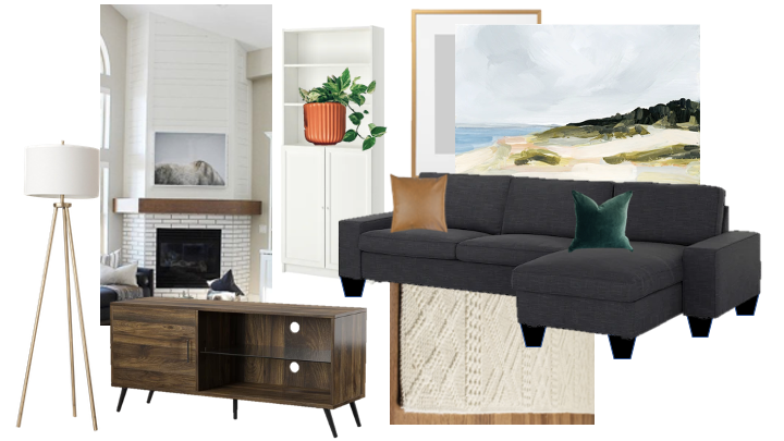
Today I’m sharing some before pictures of the space as the old owner had it set up, and when we first moved in, as well as a moodboard for the finished space. The living room isn’t huge, less that 170 square feet, but it’s where we spend the most time so it’s important to me that it’s comfortable and makes us happy. Our requirements for the space are that it feel cozy and comfortable, that it have a big TV (sorry, we love TV), and lots of places to stretch out and relax. It’s also where my dog Abby spends most of her time so it needs to include a dog bed big enough for the 90-pound monster she is.
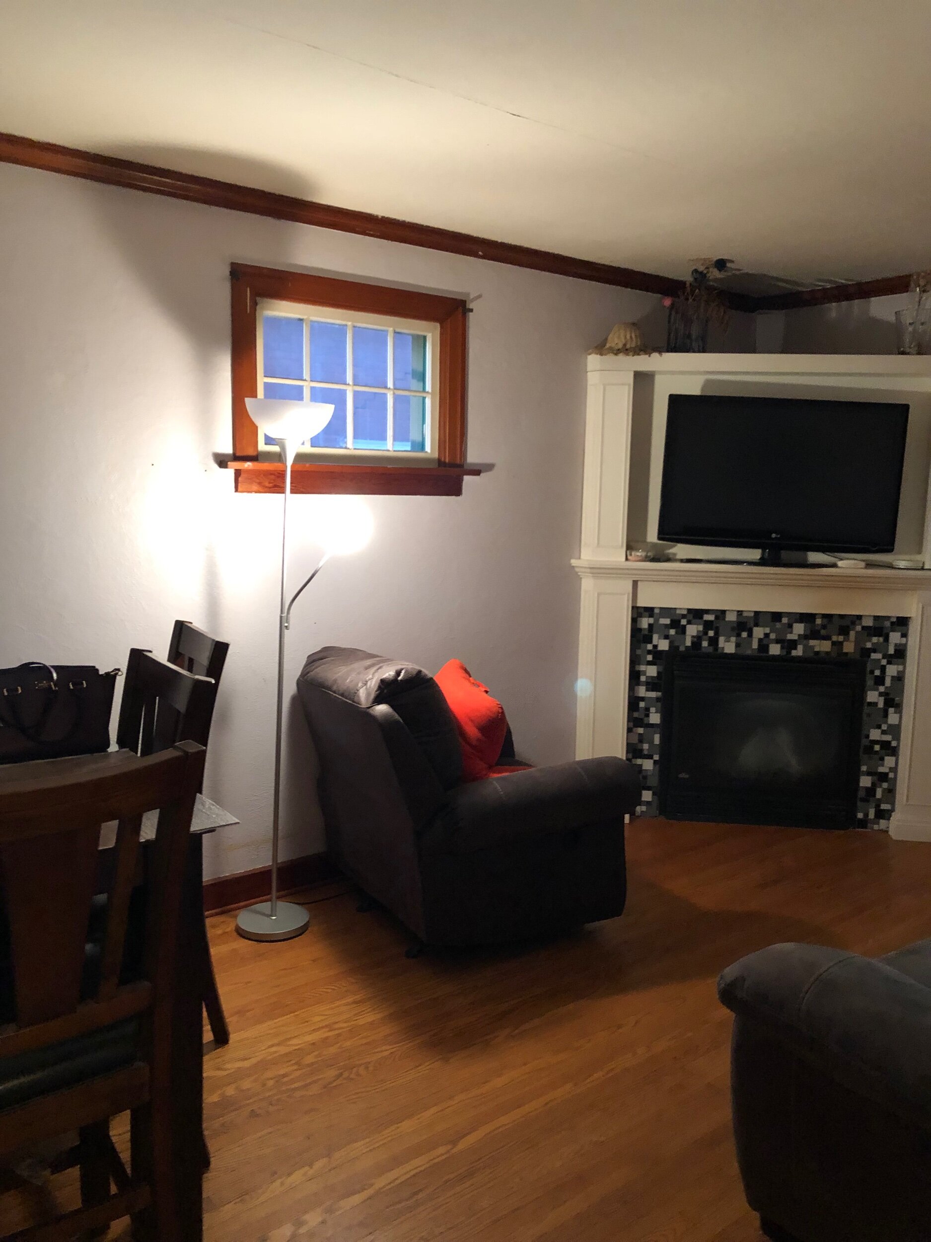
before we moved in
I think it’s important to show the room as it was before we moved in to showcase the importance of staging! This room was set up as a living room/dining room but it felt incredibly crowded. Only three of the six dining chairs were usable, the living room furniture could only seat 3 people and they were at bad angles for both conversation and TV-watching. You can also clearly see the lack of overhead lighting - the one floor lamp makes the room feel dark, not cozy.
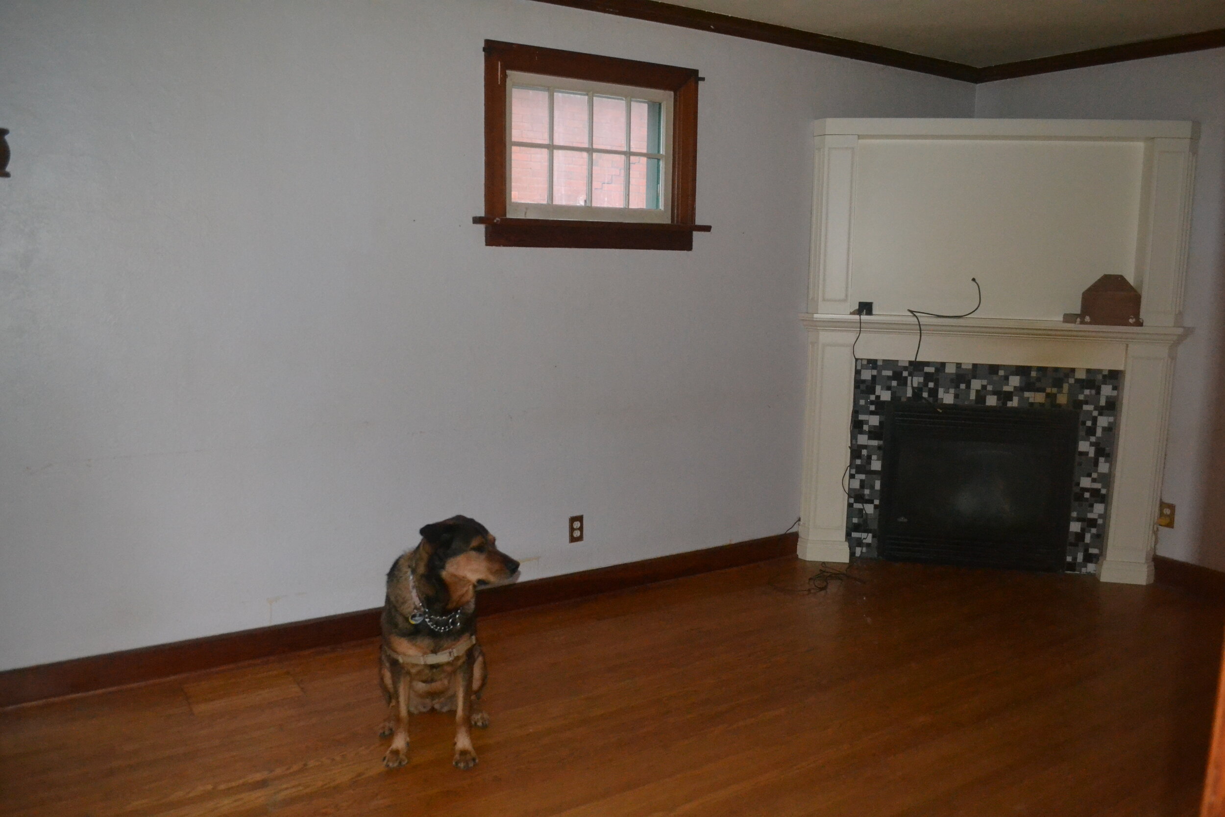
when we moved in
The beautiful bay window is hidden by smoke-filled curtains.
The walls look.. sort of white, but they’re very dirty and yellowed in person.
Even Abby knows this fireplace has to go.
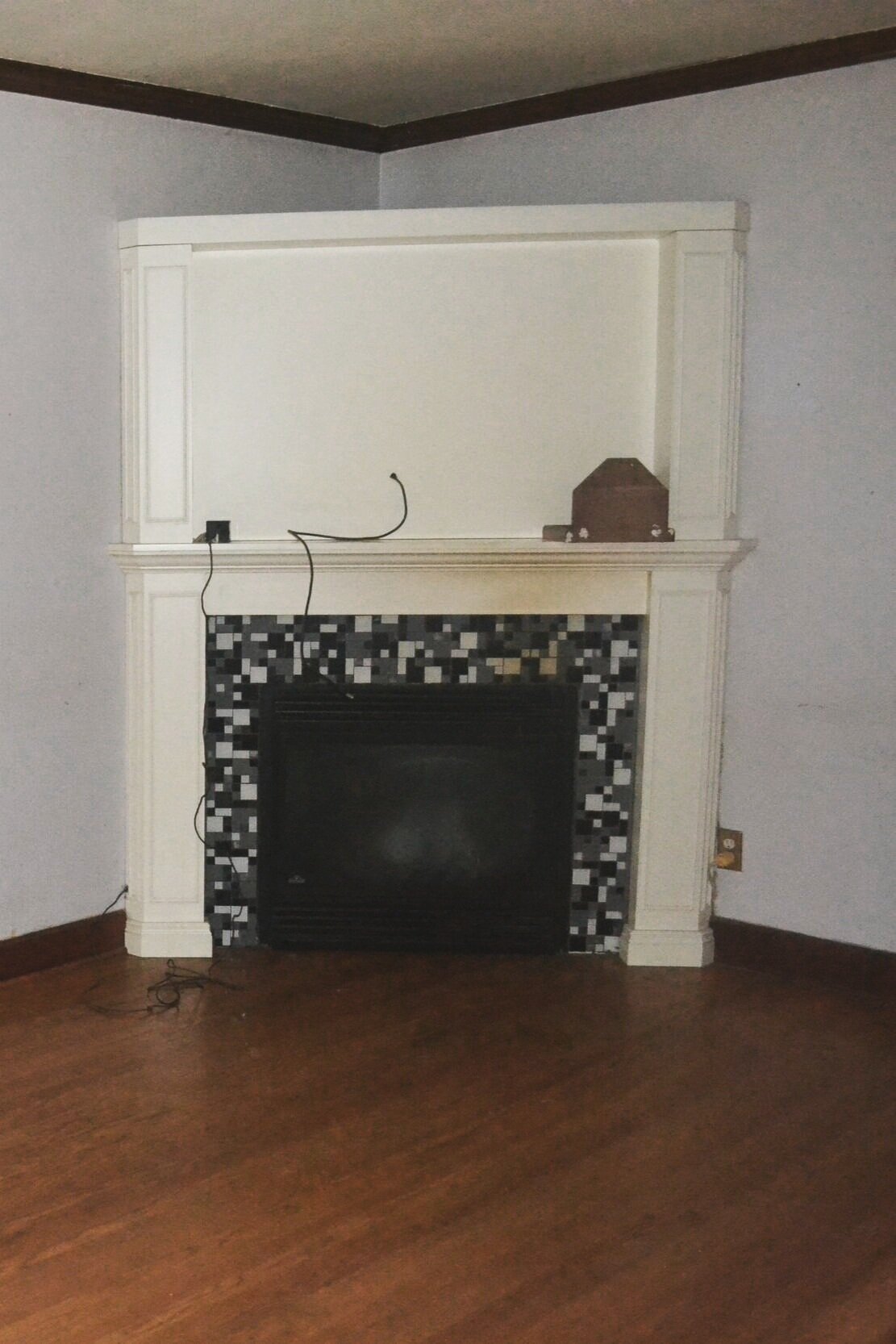
fireplace
This room also houses the gas fireplace that came with the house and served as our primary heat source all winter until our ductwork and furnace was installed recently. I’ve always wanted a fireplace, I think they’re cozy and wonderful, but the style of this one drove me crazy. The surround or “chase” goes almost but not quite to the ceiling which makes it obvious that the fireplace isn’t real or original, not to mention being a dust trap. The style is at the same time too modern for the age of the house (built in 1939) and too old to be modern. Ultimately, I think it stands out in a bad way. We actually started work on the fireplace with the help of my family back in January but I haven’t shared it here yet since it’s not done so throughout the next few weeks I’ll share how we’re completely transforming this fireplace by taking away the original surround entirely and keeping only the gas fireplace insert!
You can also see that there are cords and wires running everywhere and that the surround sticks out enough to touch the outlet on the right. All the wiring gets cleaned up and tucked away and I’ll push back the fireplace surround to take up less physical and visual space in the room. My goal is to make the fireplace look like it belongs in the space, at first glance like it might have always been there.
the plan
projects so far
I’ll be putting finishing touches on these things and sharing the step-by-step
Prep and paint the walls and ceiling
Strip down and rebuild fireplace surround
Raise height of IKEA couch
Projects to come
Frame giant over-the-couch art from Juniper Print Shop
Add more lighting
Build and install fireplace mantle
Repaint and fix up old wooden window
Potentially add a hearth for the fireplace?
A small room with a big couch, TV, and dog bed might never look chic or magazine-ready, but I’m confident it can look bright and inviting - the kind of place anyone would want to flop down with a bowl of popcorn at the end of a long day or week.
I’ll be back next week with some more info on the large-scale art for this space, in the meantime you can follow me on Instagram for progress along the way.
Make sure to check out all the other amazing transformations by both featured designers (on Wednesdays) and guest participants (on Thursdays)!
